What is it about a homepage that leads to so many homepage conversion mistakes for websites?
When someone lands on your store’s homepage, it’s sole purpose is to transition your visitors from “window shopping” to buying. Nothing more.
The last thing you want is for them to click the back button to swiftly return to wherever they came from…
Or click over to a different browser tab…
Or nonchalantly scroll partway down the page and then disappear without a trace.
But sadly, this is what happens with most stores because they make these 5 fatal homepage conversion mistakes:
Homepage Conversion Mistake #1 – Rotating carousel banner
Numerous split-tests have proven over and over that one static image performs better than trying to force your visitors to sit through a tedious carousel of often gratuitous and meaningless ‘aspirational’ images.
Keep your banner a reasonable size too, if it forces all the other content on the page below the viewable area, it will cost you sales.
(Hint: The Shoptimized™ Theme encourages you to only upload one impactful banner when you configure it. That’s why it’s rated as one of the best converting Shopify Themes.)
Homepage Conversion Mistake #2 – Meaningless banner content
I hinted at this above, but there really are only two things your banner should do or it’s wasted space…
Firstly, it should convey your value proposition (why someone should buy from you as opposed to anyone else).
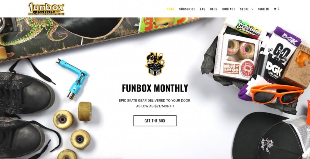
Funbox does a great job of this:
Secondly, your home page banner should promote a time-sensitive offer, like a July 4th weekend discount or free shipping offer.
If it isn’t doing one of those two things, it’s wasted space.
Oh and this almost deserves a ‘Mistake #’ all of its own—not having a call-to-action button on your banner is a crime against conversions.
So many stores forget this because they’re so focused on their ‘on brand aspirational imagery’ or some other marketing tosh, they forget to tell the visitor what to do next.
Always, always have a highly noticeable call-to-action button otherwise people might not realize the banner is clickable.
Homepage Conversion Mistake #3 – Visual clutter
Having a visual clutter on your page can often stop people from seeing and clicking on the things that you actually want them to. Especially if the clutter forces the important stuff out of sight below-the-fold.
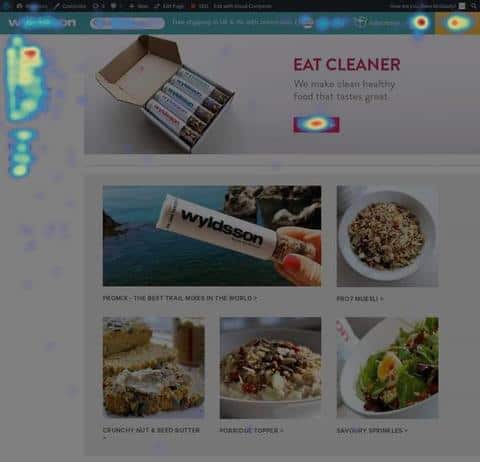
Using a tool like Hotjar to see which parts of your homepage people interact with and which parts they glaze over can be extremely revealing.
Back when I was consulting I had several winning split-tests for clients where we just decluttered pages and got rid of content that was distracting and standing in the way of making money.
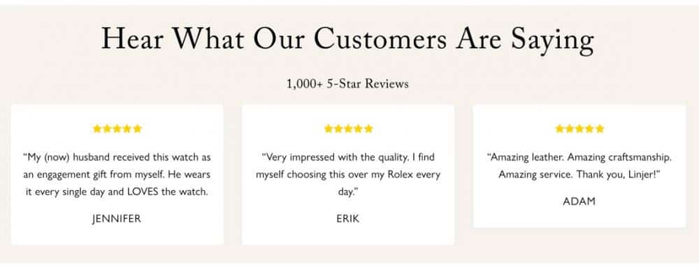
Homepage Conversion Mistake #4 – Lack of social-proof
Your value proposition may make some bold claims about why your store is the best possible choice to buy from but without some reviews, what you’re saying has nothing underpinning it. linjer.co does this really well.
If you have a media mentions like ‘As seen in/on’ it’s worth adding them on your home page too.
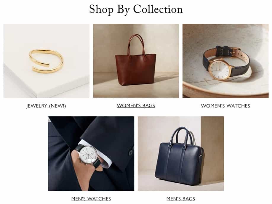
Homepage Conversion Mistake #5 – Poor navigation
Finally, as well as your main navigation in the header, your home page should allow people to quickly find their way to what they want.
Don’t overdo this by trying to shoe-horn every product you have onto the home page. I see a ton of dropshipping stores doing this. It bloats your pages and creates overwhelm for your visitors. Keep it simple.
Again, linjer do a solid job of this:
What to Do Next
So, the aim of the game is to make your home page a gateway to getting people to start shopping.
Review your page ruthlessly, cut out all the noise and vacuous content and focus on what’s essential.
Want to shortcut your learning curve? Install the highest converting Shopify theme by Shoptimized™ today.