You love your Shopify store’s storefront. It’s become your baby. Maybe you’ve spent hours tweaking it and making it look just how you want it. But what about your e-commerce conversion rate?
Why isn’t anyone adding anything to their cart? Why are you not getting sales? What’s tanking your e-commerce conversion rate?
You’ve driven traffic to the site but people just aren’t buying your products or worse, they aren’t even adding your products to their cart.
What in the world could it be?
With all things that become shrouded in love, you tend to overlook the negatives.
Get ready to adopt a fresh new e-commerce conversion rate mindset. And get ready to design your shop with a purpose: making money.
Welcome to CTA’s (or Call to Actions) – The E-Commerce Conversion Rate Savior
Your call to action is what you want your visitor to do.
- A contact form, the action you want your visitor to take is to fill it out.
- On a product page, add something to the cart.
- On the cart page, go to the checkout.
It’s the encouraging roadmap that takes your visitor from being a window shopper to a product-owning buyer.
Why is this stuff so important? If they don’t click, they don’t convert.
But don’t sweat it, we’re going to show you what you might be doing that is hurting your e-commerce conversion rate and how to fix it.
Let’s get to it.
E-Commerce Conversion Rate Killer #1:
Giving them too many choices
Have you ever gone into an ice cream store and had to pick out a flavor from an obscene amount of choices?
If you’ve been overwhelmed, you’re not alone. It’s called a choice paradox.
Or what about those new touchscreen fountain drink dispensers?
Have you ever wondered if maybe Cherry Sprite was a better choice than Raspberry Ginger Ale? (I have, I still live with the regret.)
And this is a great example of buyer’s remorse associated with choice overwhelm.
On the surface, you would think, “Yeah, people love having choices! They want to feel free to choose!“
But in reality, the choice can overwhelm and even cause you to second guess yourself if you made the best possible decision.
The key is to make the customer feel ‘good enough’ about their choice.
What can I do?
Lead them to the products they want. When you sell something with many variations or styles, try guiding the customer instead of first making them view all the products on their own. This can greatly reduce choice overwhelm.
Two great app options for this:
Guidelines Product Finders – “Lead customers to the right product, every time”
Personalization – “The AI Powered Personalization Engine”
How to implement: Use large graphics that link to collections with different ‘buckets’ the customer might identify with.
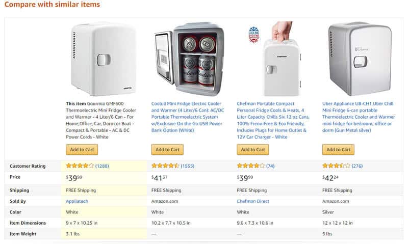
Make it easy to compare. If you sell similar variations of a product, adopt the Amazon method of having an easy compare chart for each item to help the customer determine which one fits their needs.
A great app option: Product Compare
Remind them to buy without fear. Remind visitors of your return policy frequently and boldly. This helps melt away the risk that they feel and prevents buyer’s remorse. And that’s the last thing you want them to feel with their purchase.
E-commerce Conversion Rate Killer #2:
Letting them wait to decide
When a visitor feels like the heat is on for missing out on a product, they are more likely to act.
This is used a lot in the retail world when a store runs a sale “while supplies last” or a “limited supply” sale. There’s no reason you can’t do the same for your e-commerce site.
I won’t go into the ethics of creating false scarcity. In fact, there are many legitimate ways to create scarcity that don’t make you feel sleazy.
As Dr. Robert Cialdini, the Godfather of persuasion explains, you can be a ‘sleuth’ of influence. This means finding a legitimate reason that serves both you and the buyer to explain why the product is limited.
People want what they can’t have.
What can I do?
- Maybe a supplier gave you a heads up that a certain material component will increase in price soon.
- Maybe incoming weather may cause shipping delays if customers wait to order.
- Perhaps you are going to be running a limited edition product.
- Or maybe you are doing a trial run of a new product.
Paste it on your top header bar or on your hero image. Somewhere that can be front and center to let people know specifically what is becoming scarce and why.
Whatever the reason, stating this up front helps the buyer. It lets them understand that if they want an item, they better act quick. Urgency at it’s finest.
E-Commerce Conversion Rate Killer #3:
Using button text that writes TO the customer instead of AS the customer
Many times when we write online, whether it’s for a website or some sort of advertisement, we tend to talk about “you” and “your”.
And for good reason, it’s been one of the most popular ways to get someone to feel connected to the material they are reading.
But using those words simply doesn’t convert as well in CTA buttons.
I think with the age of the internet that some things have changed. The ability to interact with websites has made the buying experience more personal.
So when we write about “get yours today” and “get your free trial”, it almost has a sense of speaking from the ‘other side of the table’.
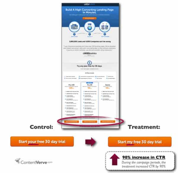
When we use words like “mine” or “my”, then it gives the visitor a true sense of ownership. They can already feel themselves starting to own your product.
Some people may say it’s our vain, self-serving, Insta-culture but we know better than that. It’s been around for a while. What’s the one thing kids say when they whine about their toys being taken from them? MIIIIIIIIIIIINNNNNNEEEE!
What can I do?
A great way to accomplish this is to simply write in the perspective of the buyer:
Get your free quote >>> Get my free quote
Place your order >>> Place my order
Add to your cart >>> Add to my cart
Customize your shirt >>> Customize my shirt
In some cases, it will sound weird or off. In those cases try using a different variation of the wording to give the greatest amount of personalization.
E-Commerce Conversion Rate Killer #4:
Using big words
As much credit as we give ourselves, we still have some pretty primitive habits when it comes to the decisions we make. Even the words ‘e-commerce conversion rate’ sound pretty complicated.
You must speak to the ‘reptile’ part of the brain when designing your Shopify store for the best e-commerce conversion rate.
What do I exactly mean by that?
It may be tempting to use big words that make your store sound sophisticated or exclusive, but that may be to your disadvantage.
The most obvious phrasings for the call to actions you typically see on Shopify stores are “Buy Now” or “Add to Cart” or “I Deserve This”.
It’s for good reason.
Small. Words. Good.
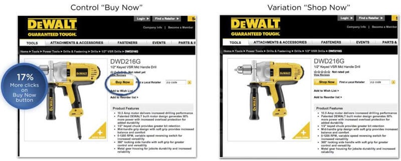
DeWalt tested two different variations of their “Buy” button and the winner was “Buy Now”.
There’s a lot of factors that can play into this result. However, it’s generally understood that the best options are shorter and more verb direct.
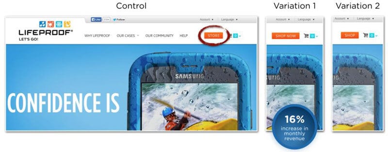
Lifeproof found that instead of just telling customers where the “Store” on their page was located, it was much more effective to tell them to “Shop Now”. Testing simple things like this increased their e-commerce conversion rate.
What can I do?
Take inventory of your site and see where you are using an extra wordy button or navigation menu text.
Use a thesaurus if you need to. Find any way to use shorter words so you don’t make a flop of getting your customers to click or get your meaning.
E-Commerce Conversion Rate Killer #5:
Bad, bad design
It means your store may look pretty, but it isn’t making you money.
You’re probably giving your audience (humans in general) too much credit when they’re looking at your Shopify store.
There’s no solid evidence as to what color converts best for CTAs, but it doesn’t mean the color doesn’t make a difference.
That’s why it’s super important to test these key factors.
What can I do?
Here are a few key points to keep in mind when deciding on the color to maximize your e-commerce conversion rate.
- Make your CTA button stand out by using clear and definite white space around it.
- Make sure the color of your CTA button differs from the background.
- Don’t make it too wild with crazy animations but don’t be afraid to test.
You may have noticed I’m using CTA and CTA buttons interchangeably. It’s because your CTA should always appear as a button.
What makes something look like a button? In the most basic sense, text basically surrounded by color and an obvious border.
Having a button stands out more than having just a text link.
Remember, the whole point is to move the most people from the visitor bucket to the customer bucket. There are a ton of studies showing that buttons work best for directing people on what to do next for the checkout process.
Conclusion
When you’re trying to make your site a lean-mean-converting machine, it can be difficult to make all the changes and have everything look good.
Plus, by the time you’ve added all the apps that could really help your site, your site’s speed takes such a hit that it won’t matter how convincing it is because no one will be patient enough for your site to load.
That’s why we created the Shoptimized™ theme to help you save up to $2,011 per year on costly and slow-loading apps.
We’ve packed years of trial and error and real-world testing into our theme to eliminate all the e-commerce conversion rate killers most stores suffer from. From the CTA button text to the placement of each element. Every detail has been tested and proven to increase your e-commerce conversion rate and that’s why it’s the one of the top converting Shopify themes.
Download your copy today and start seeing improved conversions straightaway.