Other resources:
-
8 Elements of High-Converting Product Pages
-
How to Write Product Descriptions That Sell: The Ultimate Guide
And today I want to talk to you about how to craft the best Shopify product web page.
Top Tip: If you want to shortcut customizing your existing Shopify theme, checkout the Shoptimized™ Theme, it’s blisteringly fast and is the highest converting Shopify theme.
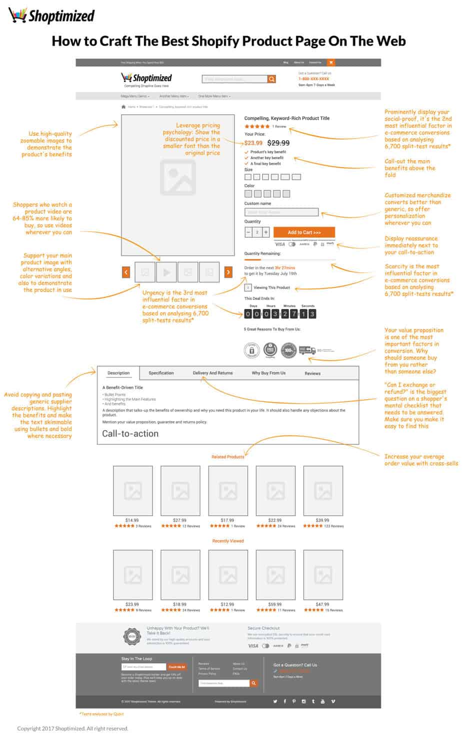
So, from top to bottom we’ve got a top bar here sometimes known as a “Hello Bar”.
You want to use this area to promote things like your Free Shipping Threshold or any special offers that you have. It’s a great area for drawing people’s attention because remember that the header area is something that people can see consistently throughout their journey. So, it’s a really great area to promote things that you want to raise attention to.
And also, on this top bar here we’ve got what you call Admin Navigation. It’s not your money links, here you put things like About Us, Track Your Order, Contact Us that sort of thing. We’ve also got a hover-over cart icon here so people can see what they’ve got in their cart when they hover over it.
Logo
Then we’ve got your logo and immediately under it, you can see a compelling strapline. A lot of people don’t do this. Clearly, it’s a wasted opportunity to tell people why they should buy from you above and beyond anyone else. Particularly if you’re in a competitive market then you need to add your strapline to convey your value proposition. I’ll get into that in a minute on how to craft your value proposition. But don’t waste the opportunity of having that in your header, because it’s really important.
Search Bar
Now 10-12% of all e-commerce site navigation is done via the “search”. So if you’re hiding it behind an icon or you haven’t got it in your header area you are missing out on revenue. Because people that interact with it tend to convert between 5-6 times better than people trying to find their way using your regular navigation. So, make sure your search bar is really prominent.
We’ve also got it on the bottom so when people scroll all the way to the bottom of the page and haven’t found what they’re looking for, we’ve got another opportunity to engage with the site search.
Another little trick here is instead of just saying something like “Search for…” preempt what they might search for. And again, this is another opportunity to promote the benefits of your products. If you’ve got a single type product rather than a multi-niche store… so it could be like “Find Awesome Fishing Gear” for example. Use that space wisely trying to prompt people to use the search bar. Because it will surely reward you with higher conversion rates.
It’s A Trust Factor
Then right here we’ve got “Got A Question? Call Us,” then your store’s contact number and your opening hours. The point of having these is “TRUST” it’s a huge part of e-commerce. And if you haven’t got a phone number then people can’t see how to get in touch with you. Then they’re not going to be likely to buy from you because they want to know whether they can get in touch with you post-purchase if there’s a problem.
Even if they don’t ring you in order to place an order or ask their questions about the order, the mere presence of having a phone number will increase your conversions because it’s a trust factor. So, put it in your header don’t bury it in your Contact Us page.
If you really don’t want to show a phone number for whatever reason, then handle that objection, say “Where’s our phone number? Then have a tooltip that will say something like ‘In order to bring you the lowest possible prices, we don’t operate a call center but we do offer support via email to keep our overheads down and we pass those savings on to you.” So you’re making it a benefit to the customer the fact that you’re harder to get to hold off. You have to handle objections because they might have a false belief that this company is not credible when actually you are, you just decided to keep your overheads down.
You’ve got to be thinking about your customers’ mindset and their mental shopping lists, what is it that they need to be checked off in their mind about your business and your product and your service before they’re going to part with their cash.
Mega Menu
We always recommend having a mega menu, if you’ve got a store with lots of products, put it in a menu rather than a dropdown list. It makes the navigation much easier and the more you can drive people through to your product pages, the more likely they are to convert.
Breadcrumbs
This is just really again for Navigation.
Product Image
Under breadcrumbs you’ve got a nice big image of the product, you need to have a zoom so that customers can see the details of the product.
Underneath that, we’ve got variant images or you want to use these images to showcase the product in use. If you can demonstrate the benefits of owning the product then people can see themselves owning it.
Another little trick here is, if you can use images of people, that are using the product, that is very similar in age and demographics to your typical customers, then again, they’ll be able to see themselves using or owning the product.
Another thing to do here is use videos, everyone knows “Zappos” – every pair of shoes on their website has a video with it because they know that people want to see the detail and see the different angles of the product and give it more a touchy-feely kind of experience because they can see the product in a more detailed way through the video.
So if you have them available, or you can make them inexpensively, that would raise your conversions. People are 64-85% more likely to buy once they viewed a video of your product, so make sure you’re doing that.
Compelling Keyword Rich Product Title
Don’t just copy and paste the product titles from your suppliers, especially if you’re buying from AliExpress. Come up with something that:
A. Helps you get found in the Search Engines
B. Makes it compelling. It should be attractive and it should answer what it can do for people who buy your product.
Reviews
Social proof is the second most influential factor when it comes to e-commerce conversions based on 6700 split-tests analyzed by Qubit through their split-testing platform. So, it’s not to be ignored you -need to make sure that reviews are really prominent.
Price Psychology
So, for example, we’ve got the previous price for $29.99 and the price they buy at is $23.99. You will notice that the selling price has a smaller font because psychologically not only the price is different but the physical size is different too, so it implies a saving and it’s just another little trick that’s going to help boost your conversions.
Key Benefits
These are some just benefits of the product so you can say like “Free Shipping If You Spend Over $50” or whatever it is but things you want to draw peoples’ attention to.
Variant Options
Make it clear what people need to do and what their options are. If you’re trying to be clever and burying your options underneath like cascading menus and stuff like that you’re just going to destroy your conversions so keep it nice and simple.
Personalization Product Option
If you’re trying to offer personalization or customization of your product you can use this option. Tons of the big brands are doing this now. You can buy jewelry with a name engraved on it, boyfriend’s, girlfriend’s name, or whatever it is let people do that. Basically, it increases your conversions because people could again make it more of an individual gift. So, if you can add this option, do it.
Add To Cart Button
There’s a big myth going around about big orange buttons converting best and that’s absolute B.S. It has nothing to do with that, testing has proven that it’s how much it contrasts to your page.
Now I know on the mock-up here, we’ve made it orange but it doesn’t really matter what color it is, it’s whether people’s eyes are drawn to it. So, if the rest of the color of your site has like bluey feel to it or whatever, then an orange button is going to work because it contrasts to the page but if the whole of your site is orange it doesn’t stand out so well, so the important thing is contrast.
The call-to-action on the Add-to-Cart Button, you need to test that as well because “Buy Now” or “I Deserve This” might work better than Add-to-cart for your market so that’s an easy test you can do using something like Google Optimize.
Underneath the Add-to-Cart Button, you want reassurance as to how they can pay. So, these are all trust symbols, we’ve got the ways that they can pay and also the Shopify security seal here. So, it’s just to add that level of trust and reassurance to people.
And now we get into what I consider to be two of the core levers in terms of how you’re going to drive up your conversions. One is scarcity, and the other is urgency.
Most Influential Factor In E-Commerce Conversions
Scarcity – is proven from analyzing the 6,700 split-tests that Qubit did. They proved that scarcity is the most influential factor in e-commerce conversions. So, show your remaining stock and it’s really easy to do and what you also could do is show a counter of how many people are viewing the product right now, so it gives that sense of like “someone else might buy this before me”. So, if you can introduce that element of scarcity then you’re going to be on to a winner.
Urgency – If you’ve got a same-day shipping deadline for example at 3 PM Eastern, they order before then, you ship the same day – tell people.
Order in the next 3 hours 27 minutes and get it by Tuesday – whatever the date is.
It’s very easy to do, you can use an app or with our Shoptimized Theme, it’s a built-in feature.
You can also add urgency if you’ve got a deal or sale that is ending in a few days or hours or whatever, have a countdown timer, again it’s a sense of urgency and will induce people to take action now rather than later because on the web it’s all too easy just to just think I’ll come back later.
Value Propositions
This is the difference that makes the difference in terms of why people should buy from you and not anybody else. Again, it’s all too easy for them to think of coming back later or they can just go back to Google and find it cheaper. So, why should someone buy from you rather than anyone else? You really need to get this nailed because it’s going to underpin everything you do in your ads and how you move forward as a business.
So, these examples we’ve got here are “Free Shipping On Everything”, ‘Easy Returns,” “free shipping both ways,” that sort of thing or it could be like “The Web’s Biggest Selection of whatever you sell” or “Family Run Business” or “Veteran Owned,” anything like that, that can give you a point of difference that potentially is a benefit to their consumer. Craft your value proposition around that, it will pay dividends for you.
Description Section
The really important thing here that most people kind of just cut corners on and that is they’ll get a supplier it doesn’t matter if they’re Chinese or a US-based wholesaler, whatever they just copy and paste the description straight from their website onto their own.
And that is just a recipe for failure because usually those descriptions are very feature-based and not benefit-based and the English aren’t always great and you’re just going to be the same as everyone else.
Now, JPetermanis probably the best example of any e-commerce descriptions in terms of copywriting JPeterman.com. Their product descriptions tell a story, they’re romantic, they evoke emotions and you want to own the product by the time you read because it gives you that sense of you’re buying a story as opposed to buying a commodity.
Benefit-Driven Title
So, obviously, everyone’s not going to have those copywriting skills all the time to do it. But as a bare minimum you’re going to have a benefit-driven title then you’re going to have some bullet points to highlight the main feature and the benefits of your product. Most generic product descriptions just focus on features so it’s like…
– This product comes from Blue, Green or Red
Let’s use a car for example.
– The Ford Mustang has got a 4-liter V8 engine
That is a feature, the benefit of that is “you can smoke everyone at the traffic lights” and ultimately the emotional benefit is status and pride, or one-u-manship. You want to try to tap on those benefits, those emotions if you can when copywriting and it will pay dividends for you again because you’re:
A. Different
B. You’re doing a better job of salesmanship and that’s fundamentally what this is.
So, we’re structuring these in a way that can be skim-read as well because again people’s attention deficit disorder on the web is pretty extreme nowadays.
So, the description should talk about the benefits of ownership and why you should have this product in your life so people can see themselves owning it and using it.
And then mention your value propositions like this and your guarantee a returns policy—A massive question that a lot of people try and hide from is answering is your guarantee and returns policy.
You’ll Reap The Benefits
The longer your guarantee, the more money you will make. If you take all the risk off of your prospects’ shoulders and put it firmly on yours, you will reap the benefits. I know that sounds counterintuitive.
And people feel like they’re going to be ripped off by customers using the stuff and returning it. If you put “365 Day Guarantee” then people will feel really comfortable buying from you because there’s no rush of returning it to you and actually what happens is apathy kicks in and they think “I’ve got ages to return it” even though they want to send it back they will forget it so it actually works in your favor. Have a look at Zappos.com again there’s a reason why they have a 365 Day Returns Policy because they know that it increases their conversions.
After you’ve done that, the thing to do is have a call-to-action so either, repeat your button again or just tell people what to do, it’s as simple as that. So, they read this, you don’t want to rely on them having to think about scrolling back up, you could just have another button in here or just say “Click the Add-to-Cart button”. Tell people what to do.
Then these other tabs here, you might need a specification one or a sizing chart although I suggest having a sizing chart link up here if you’re selling apparel or that sort of thing because it’s a big question that comes up, “Is it going to fit?” But if it’s a more technical product you can have a Specification Tab.
Delivery and Returns
Have a “Delivery and Returns” tab, again so people can easily find that information because they won’t buy from you until they have that answered.
You can also have a “Why Buy From Us Tab” so again that’s just reinforcing your value proposition, you can just go into more detail about that.
And then a “Reviews Tab” because people will check out your social proof. As I said earlier it’s the second most important factor on any e-commerce store in terms of conversions.
You also need to take the opportunity to cross-sell other products to your visitors. So, you want to have a related products section that complements the product that they’re already looking at.
You also want to have “recently viewed” because if they’re just surfing around the site they might have forgotten what they looked at or can’t remember how to get back there from the navigation, so just make sure this auto-populates as they move through your store.
They Want To Know That You’re A Bonafide Business
Finally, the footer section. Obviously, this is a site-wide factor but we need to talk about this because again it really plays in conversion. People look at this stuff.
One of the main things they look for is your “About Us” page, they want to know your story, they want to know that you’re a bonafide business, so DO NOT skip having an about us page on your site and make sure people can link to it.
But also here, we’ve reinforced the guarantee: “Unhappy With Your Product? We’ll Take It Back! 365-Days to Return Your Product.”We’ve pulled it out rather than burying it somewhere behind a link, we’ve put it as a part of the footer so people can see it site-wide.
And then we’ve added reassurance showing again the credit cards that they can use to pay, Paypal, and all that good stuff.
And then again here we’ve got a newsletter opt-in. You want to be building a list of people who don’t purchase on their first visit, which many don’t with e-commerce that’s why we need retargeting.
Join Our Newsletter
Try to capture their email address if you can. Sell the opt-in, don’t just say “Join Our Newsletter” tell them what the benefit of joining your newsletter would be:
– Exclusive discounts
– Being the first to know about cool new things
Because people like being the first to know it plays into their kind of “status” core human emotion. Core emotions like greed, status, fear all those things that motivate people to buy. And then the call-to-action doesn’t just say “Submit” it says “Count Me In.” Again, we’re trying to get people to take action and compel them to do it.
Just like I mentioned earlier, we’ve got the site search again and then some quick links to things like:
– Privacy Policy
– FAQs – this is a good one people for people if they’re unsure of buying from you.
And we repeated the phone number down here as well, again people might scroll down all the way to the bottom and not noticed it at the top, so have it down the bottom as well.
The Other Thing About Amazon Is
Now there’s a lot of elements there but don’t fall into the trap of trying to be like Amazon. I see so many people doing this with their stores and think that Amazon is the best e-commerce store in the world so“I’m just going to do what they do.”But what you’ve got to remember is they already have the trust in place. They’ve been around for donkey’s years, people know them, they’ve had their credit cards on file for years. They don’t need to overcome that hurdle, while people that come to your site it’s likely the first time that they visited, so you’ve got to build that trust.
The other thing about Amazon is, their pages are really busy and cluttered. You can’t afford to do that because people aren’t familiar with the layout of your web page in the same way that they are with Amazon.
Amazon has incrementally built up those iterations to their web design over literally decades now and people have got used to it in small bite-size chunks.
If you present someone with a page like Amazon’s on their very first visit, they’re just going to get overwhelmed and leave because there’s too much clutter, too many call-to-actions… it’s like “Do I buy this” or “Do I frequently bought together”.
There’s just so much going on that you’re just going to overwhelm people, Amazon can get away with it but YOU CANNOT I’m pretty sure of that.
So, make sure you’re doing this stuff to increase your conversion but the point here is to test everything.
Google Analytics
Google Optimize is a free split-testing platform you can plugin now. It shows you really clear reports in your Google Analytics showing how the tests are performing and just test the elements but don’t just do stupid things like button colors.
Be strategic about it and understand what it is that’s preventing your visitors from buying because the likelihood is you’re probably not answering some of the questions on their mental shopping list like I spoke about earlier.
They will have a list inside their head of like “Can I trust this store,” ‘Is it safe to leave my credit card information,” ‘What happens if I have a problem with my order,” “Can I get in touch with them easily if I have a problem.”
All these things need to be checked off in their minds and if your page isn’t doing that, you’ll be leaving money on the table because it’s all part of the “persuasion equation” if you like.
Now, a really useful tool isHotjar if you want to find out what your visitors are thinking and how they interact with your pages, not only can you use it to see heatmaps to see where their attention is going, or where their attention is not going, and they’re missing places you want them to go—you can look at visitors session recordings as well so you can literally see over their shoulders as they are surfing your website but you can also trigger pop up polls on your page.
What’s Missing On Your Page
So, on this page you might trigger an exit poll as soon as someone moves back up towards the exit button or to close the browser, it triggers a little poll that says “Hey! Quick question before you leave. What was it that stops you from buying today?” A really simple question, run that and gather at least 200 responses and you’ll find that you get massive insights as to what’s missing on your page.
It might be that people notice that you’ve done something really stupid like copy and pasted the dimensions of your product straight from Aliexpress and it’s all in metric and your target market is in the USA and they don’t understand what that is because they’re using the imperial measurements.
So, you might get a lot of feedback from Hotjar saying ‘I don’t understand the sizing it needs to be imperial so I left,” something like that or you might find people saying “Your return policy is too short, I can’t get the product check it out and return it to you within 7-days, it’s not feasible.”
So, make sure you are gathering insights before you do anything. Because if you start just getting a split-testing tool and just thinking I’m just going to change the orange button to black, you’ll get absolutely nowhere. They are meek tweaks, you want to go with big bold changes based on insights you’ve gathered from asking questions and analyzing heatmaps and visitor session recordings and all that stuff.
Alright! So, let me know how you get on and I will talk to you soon!