Whether you’re sending traffic to a Shopify product page or a custom landing page built with an app like Funnel Buildr, you need to make sure you have these 9 essentials covered to get the ‘Add-to-Cart’.
Here are some irrefutable design rules to make your product page convert better (all of which are factored into the best converting Shopify themes like Shoptimized™):
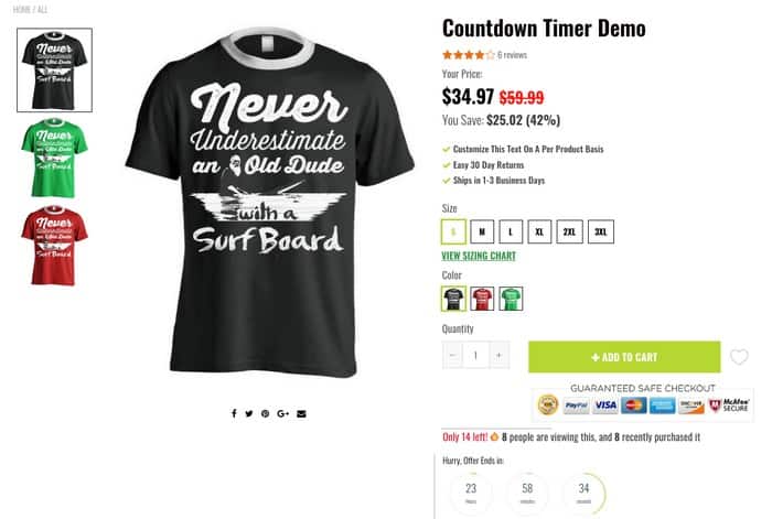
#1 – The Money Shot
First, make sure the money shot is viewable without having to scroll (AKA above the fold). You don’t want all the main elements hidden out of view.
This means your product images, thumbnails, product title, price, urgency/scarcity elements, color swatches, Add-to-Cart button, etc. are all above the point where the customer would have to scroll down.
See this example from the Shoptimized™ Theme’s Demo Store:
#2 – Product Images
Have you ever noticed how when women breeze through a clothing store, they often fondle the clothing’s fabric as they walk past a rack?
It’s how they quickly assess whether an item needs further scrutiny after it’s caught their eye.
Sometimes they’ll hold a garment up against themselves before even bothering to try it on.
And when they’re shopping for skincare products, they put a sample on the back of their hand or lift the lid and inhale tentatively.
Well, online you can’t do any of those things so you have to do the next best thing.
This makes your product photos an incredibly important part of the ‘persuasion equation’. So:
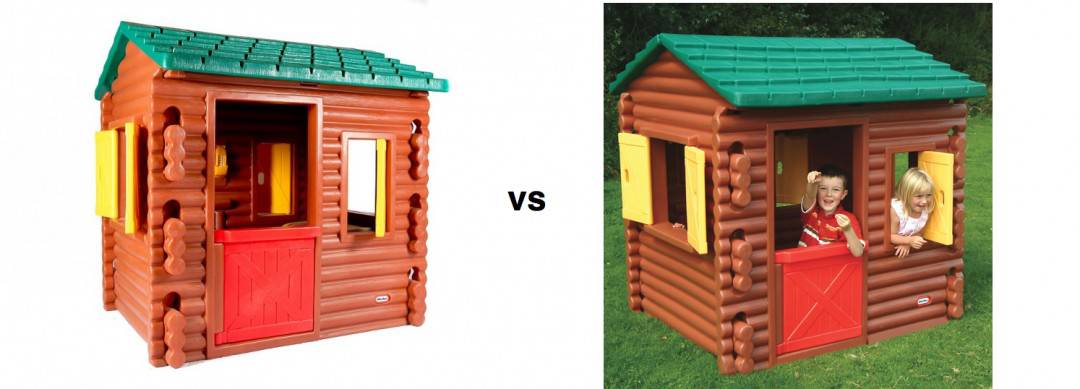
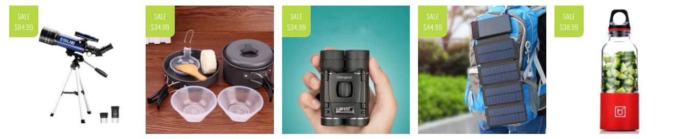
- Use images that demonstrate the product benefit wherever possible (see image below)
- Show your product from all angles
- Don’t use images that alienate your audience, i.e. using 20-year-old flawless models to sell to seniors. PlaceIt has some great mockup templates.
- Enable click-to-zoom so people can see the detail
- Size all your images consistently (more on that below)
- Use a product video if you have one or create one with Promo
- If you sell anything that has various sizes, like apparel, include a size chart as an image as well as having a link next to your size options so people can’t miss it (see the image above)
- Add SEO-friendly Alt Tags – you can do this in bulk with an app like SEO Image Optimizer.
#3 – Consistent Image Ratios
The image ratio is the ratio of the width to the height of your images.
A lot of store owners completely goon-up image ratios by uploading images straight from their suppliers or by not cropping/resizing their images to a consistent size.
And when your image ratios aren’t all the same, you end up with messy-looking collection pages and messy thumbnails alongside your main product page images.
This one factor can cheapen the look and feel of your entire store.
So, the easiest thing to do is to crop all your product images so they’re square.
What if I’ve already uploaded all my product images and they’re all different shapes and sizes?
Don’t worry, you can use an app called PixC to automatically resize your images for you.
You’ll be amazed at what a difference it makes to your site’s overall feel.
#4 – Consistent Image Sizes
You don’t need to worry about uploading large images to your store and it affecting page speed. Between Shopify and your theme, they will do the heavy lifting of resizing them.
You will need to compress the file size though, so it’s a good idea to compress them with a tool like TinyJPG or ImageOptim first.
Here are the stats:
- Size: Square – up to 2500 x 2500px
- Type: JPEG only
- Quality: 60%, progressive, don’t embed color profile as it has little value.
#5 – Scarcity & Urgency
According to a study by Qubit, the #1 influencer on conversions is scarcity and #3 is urgency (keep reading to discover what #2 is).
There are several ways you can inject scarcity/urgency into your store but you might not want to use them all. It might be overkill.
Get-it-By Timer – induce a sense of urgency by telling people when they’ll get their order if they place it before your daily shipping deadline.

Quantity Remaining – showing that an item is running low envokes ‘FOMO’—the fear of missing out and motivates people to buy now.
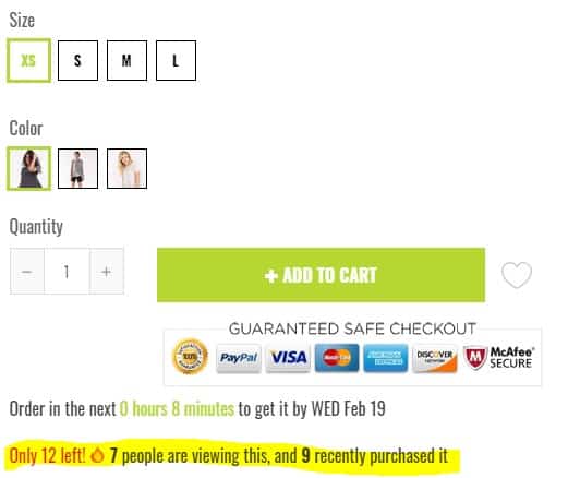
You can amplify this with some live stats to show how many people are viewing the item right now and how many people have it in their carts too. This is a formidable combination of scarcity/urgency and social proof.
If you’re running any kind of offer, showing a countdown timer for when it ends gets people to act now rather than later.
Pro-Tip – Use an app like Deadline Funnel to sync a timer on your product page with a timer inside your email reminder messages about your promotion.
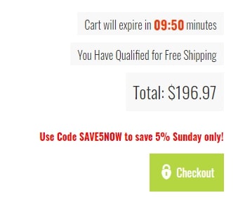
If you have items in high demand, you can add a countdown timer to the cart/checkout page, like this:
#6 – Social-Proof
If you don’t have reviews on your store, you’re sacrificing sales in a big way. Social proof is the 2nd biggest influencer on conversions according to the Qubit study I mentioned above.
An app like Loox is perfect for the job and if you’re dropshipping from AliExpress, you can even import the reviews from your supplier.
It’s imperative that you have a well-optimized review gathering system in place, reviews are the lifeblood of e-commerce. Without them, your store is doomed.
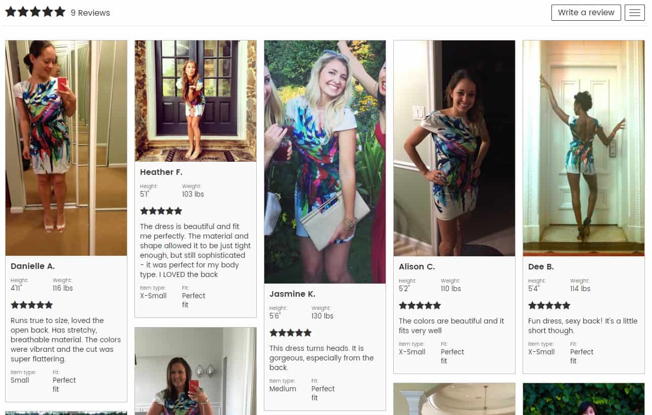
Consumers trust product reviews and photos much more than marketing assets. Fortunately, apps like Loox make it easy to collect reviews from your customers.
#7 – Persuasive Product Descriptions
Simply copying and pasting your suppliers’ descriptions one cut it. They usually lack salesmanship and you don’t want the same copy as everyone else if you want any love from Google.
You must invest the time in writing compelling descriptions that cover all the FAQs and overcome any know sales objections. And of course sprinkling some keywords in there helps too.
We’ve written an in-depth guide called, How to Write Product Descriptions That Sell: The Ultimate Guide so you have everything you need to write high-converting sales copy for your products.
#8 – Reasons to Buy Icons (Your Value Proposition)
The fact is that each and every shopper on your Shopify store will ask themselves this question – usually sub-consciously – but which ridiculously few e-commerce store owners bother to answer for them.
“Why should I choose you?”
Before they get their credit card out, they want reassurance that they’re in the right place to buy whatever it is you’re selling and don’t need to bother looking elsewhere. Especially with Amazon being most peoples’ go-to.
For example, Generation Y consumers care more about product and workforce sourcing/ethics than price. Brands are beginning to understand this, like:
- Everlane.com who are transparent about their factories, work conditions, and ethics.
- Dr. Bronner’s, the organic soap company, that has their founder’s eccentric social and environmental justice printed directly on the label of each product.
- Lush, which prides itself on several ethical values that run their business decisions.
But even if you’re drop shipping, you can find a unique angle to make your own.

As the business owner, you’re on the inside of the bottle trying to read the label, so to speak so it can seem tricky finding a point of difference if you’re selling something that isn’t unique.
Put the time into coming up with why someone should choose your store over another. It’s an essential part of the persuasion equation so that’s why we wrote an in-depth guide to help you nail your value proposition.
#9 – User-Friendly Returns Policy
First-time shoppers will almost habitually check your Shopify store’s Returns Policy as part of their ‘mental checklist’ before deciding to buy.
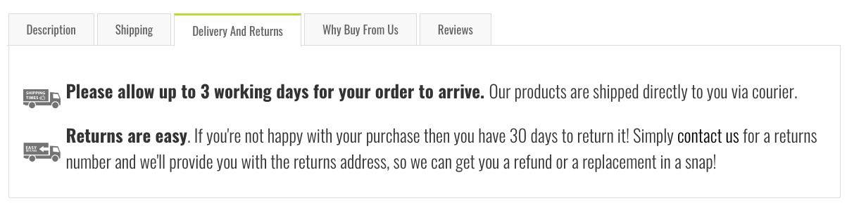
If your Returns Policy stinks or is difficult to find, your conversion rate will tank. The more you can remove any risk from your customers’ shoulders and place it firmly on yours, the higher your conversion rate will be.
Read this helpful guide to making your Returns Policy one of your most powerful sales weapons.
What to Do Next
Just go do this stuff! If you’re not already using the Shoptimized™ Theme, consider switching today because it makes implementing all of these recommendations easy—it was built with all of them in mind. That’s why it’s rated as one of the best converting Shopify themes.