Why you need this Theme Optimization Tips?
Based on our first-hand experience, incremental improvements to your store can have a dramatic impact on the overall conversion rate of your Shopify store. 1% here, half a per cent there may seem inconsequential but each tweak adds up to a significant improvement.
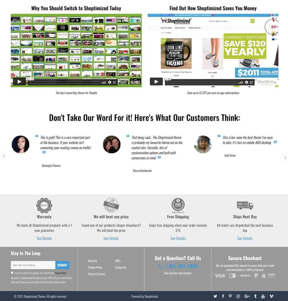
Follow these simple tweaks that will compound to give you a healthy boost in conversions. Don’t worry, you don’t have to do them all at once. But if you’re in a rush to maximize your conversions you could switch to the best converting Shopify theme today:
Theme Optimization Tips Element #1 – Header
Your store’s header is, without doubt, the most important piece of real estate on your store. It’s consistent throughout your customers’ journey and not only sets the tone for your brand. But should also contain vital elements that help in the overall ‘persuasion equation’ for what you’re offering.
Because of this, you have to ensure every pixel that forms part of your header earns its keep.
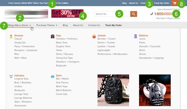
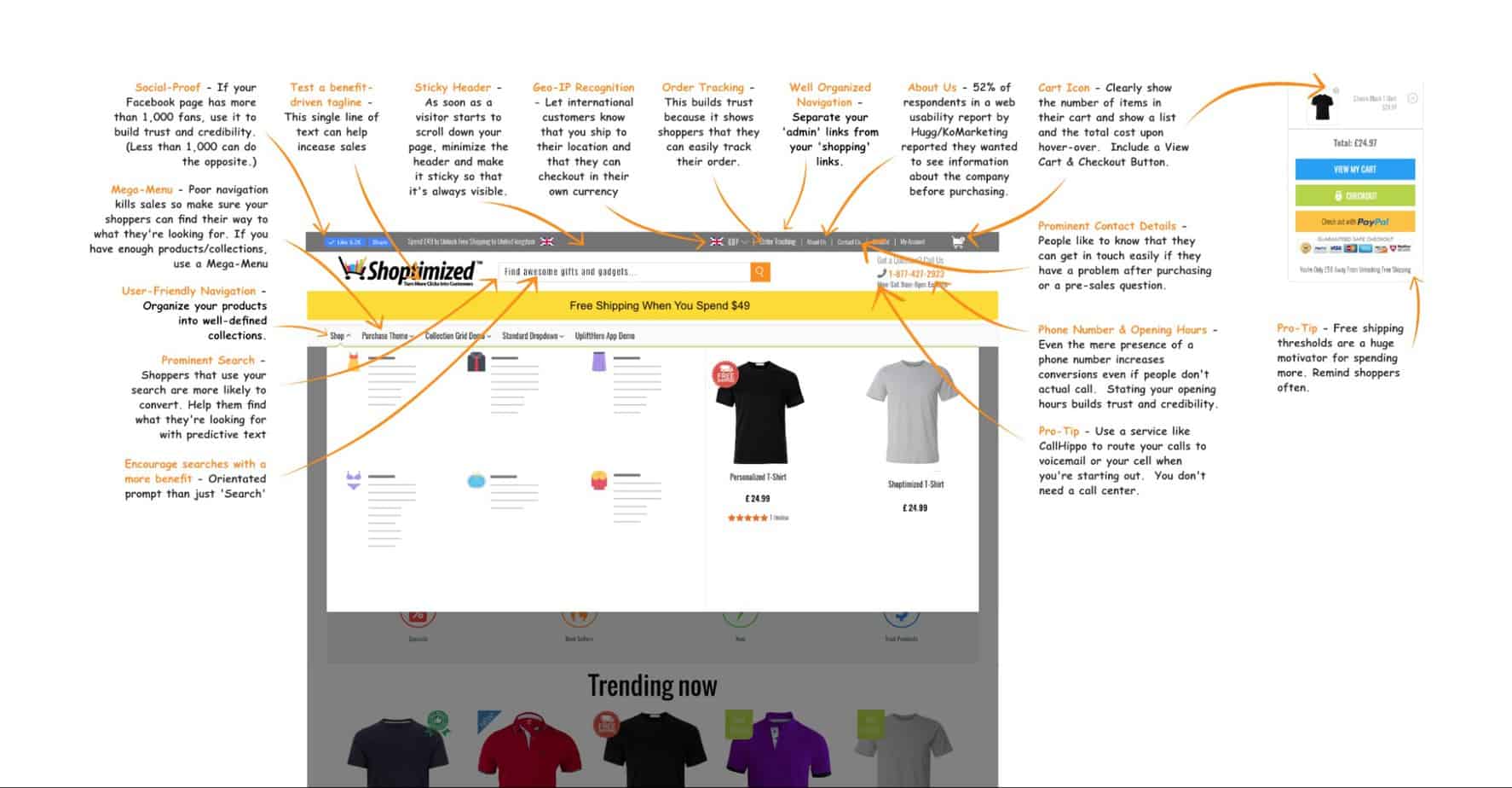
8 simple ways to optimize your store’s header
1.-Add a ‘Hello bar’
A Hello bar or header bar lets you announce special offers like free shipping or flash sales.
2.-Add a compelling tagline
Test various compelling taglines (AKA straplines) under your logo and see which value proposition converts best.
3.-Split navigation
The Baymard Institute (The world’s leading authority on e-commerce conversion and usability best practice) recommends having an upper and a lower navigation for best results. The upper navigation should only be used for your admin-type links like customer support, about us, order tracking and FAQs. The lower navigation should strictly be for your collections and products. This is so your visitors can find their way straight to spending money with you.
4.-Mega-menu
The Baymard Institute also recommends a mega-menu as an essential usability and conversion tool when you have multiple collections and products. Siloed menus are a conversion killer for stores carrying large varieties of products. Make sure your mega-menu doesn’t take up the whole screen when users scroll down.
5.-Promo/Deal of the Day banner
This optional optimization can be used as an additional way to promote special offers or your deal of the day site-wide.
6.-Prominent search
It’s no secret that visitors who use your store’s internal search feature are up to 3 times more likely to convert than those that don’t. Sadly most stores inadvertently camouflage their site search making it hard to find costing them precious conversions. But don’t just make it easy to find, you should also customize the prompt text that’s displayed within the search field with some compelling copy to encourage more searches.
7.-Display a phone number
Clearly displaying a phone number and opening hours in your store’s header goes a long way to building trust. Whether customers actually call you or not, the mere presence of a phone number will often give people the reassurance they need to go ahead and buy.
8.-Sticky Header
A study by Smashing Magazine found that sticky navigation bars allowed users to find what they were looking for 22% faster than stores without. This is especially significant when you think about mobile users who are more impatient and forcing them to scroll back up unnecessarily can be a conversion killer. What’s more, the same study reported that a whopping 100% of participants preferred sites with sticky navigation bars, despite often not knowing why.
Theme Optimization Element Tips #2 – Footer</h3>
Like the header, with the exception of the checkout pages, the footer is visually consistent throughout the customer journey.
And when you analyze heatmaps and visitor recordings, you’ll notice first-time shoppers often look at the footer as part of their due diligence process. They’re looking for your returns policy, an about us page, contact information, a company name and any fine print.
8 essential things your footer must include
1.-Contact us information
People like to know they can reach you if they need help either pre or post-purchase. Ideally, repeat your phone number and opening hours as you did in the header.
2.-Privacy Policy and Terms & Conditions links
Not only do they make your store look legit but without these. You won’t be able to run paid ads on Google or Facebook.
3.-Email opt-in
Capturing your prospects’ email addresses is essential to growing your business. Have an enticing newsletter call-to-action, not just ‘Subscribe’. No one wants to subscribe to a newsletter. It implies that you’re going to junk up their inbox with boring emails. Provide a compelling reason to join your list like ‘Get 10% off your first order & get entered into our monthly prize draw to win X’.
4.-About us link
Believe it or not, people look at your About page as part of their decision making process. If you don’t have one or you have a weak story or raison d’etre it will hurt your conversions. Here’s how to write a great About us page.
5.-Shipping & Returns Information
The fact is, without a solid returns policy in place, your sales will suffer. Shoppers need to know they can return stuff easily and within a reasonable timeframe. Here’s a handy guide on driving higher conversions with a user-friendly returns policy.
6.-Affiliates/influencer/media enquiries
If you’re selling your own branded products. It’s a good idea to make it easy for affiliates, journalists and influencers to get in touch via a dedicated landing page that explains how they can earn a commission or get sample products etc.
7.-Social media links
It’s a good idea to have a strong presence on all the major social media channels. The footer is the best place to show off the icons and link them to the relevant platforms.
8.-Persuasion elements
Since the footer is a consistent element on all your pre-checkout pages, it makes sense to leverage this real estate. After all, there’s no limit on how long your footer can be. Use it to include reasons to buy from you, either as icons or even videos. You can also include customer testimonials.
Theme Optimi
zation Tips Element #3 – Home Page
Hopefully, you’re not making the rookie mistake of arbitrarily sending paid traffic to your homepage so we don’t need to spend time explaining why that’s a terrible idea.
With that said, visitors who arrive at your store via the homepage either already knew your URL and typed it into their browser or have a direct link from a referral or an email or you’ve showed up in the organic results for a more general query.
Either way, the main job of your store’s homepage is to get visitors to click further into your site, i.e. a collection or product page.
Below are our top tips on optimizing the homepage but before we get into that there is one other important thing to note; People who arrived directly at a product page often click back to the homepage to get a feel for your store and what you stand for before they complete their purchase.
Plus people who arrived in the same way but can’t find what they are looking for or felt they arrived at an irrelevant product, often go to the homepage because it can feel like starting afresh.
3 things you can do to optimize your home page:
- Use banner space wisely: A carousel of banners are long-proven to be a complete conversion killer, no one hangs around long enough to view each one. It’s better to have a static banner that does one of two things, 1) promotes a time-sensitive offer, i.e. Valentine’s promotion or 2) conveys the top reasons somebody should buy from you rather than your competition. In other words, your store’s value proposition.
- Add social proof: Your value proposition may be making some bold claims about why someone should buy from you and not your competition but without social proof to back them up, they fall on deaf ears.
- Have clear concise navigation to your main collections: Trying to shoehorn your store’s entire inventory onto your homepage is a bad practice that some overnight YouTube guru once suggested and then a slew of Shopify store’s followed this inane advice. Not only is it completely overwhelming for your visitors but it massively slows your page load speed down. Simply provide banner links to your main collections or insert personalized content based on viewing history.

If you want to see more examples and delve deeper into this, we wrote an in-depth article about home page conversion mistakes.
Theme Optimi
zation Tips Element #4 – Collection Page
Your collection pages are often the entry point from organic search results or someone who arrived via your homepage. Because of this, it’s important to make sure shoppers can quickly proceed to a suitable product by helping them narrow down their choices.
Here are 4 effective ways to optimize your collection page:
- Include an easy-to-use product filter: When presented with an overwhelming choice of products, a handy filter is a must to prevent people from abandoning your site. An app like Product Filter & Search is an easy way to get it set up on your store.
- Avoid Quick View: There’s no evidence that Quick View actually increases conversions but it definitely decreases load time.
- Show alternative image on hover-over: This is a good alternative to Quick View, it allows shoppers to see more of your product by showing them a second image before deciding whether to click through or not.
- Uniform image sizes: If you have a natural flair for design, this one will be a no brainer for you but often it’s missed by early-stage store owners. Crop your images so that they’re all the same dimensions.
Theme Optimi
zation Tips Element #5 Product Pages and Cart Page
Product Pages
This page is definitely where you should focus the most attention. This is because it’s your landing page where you will send your paid traffic (unless you’re using an app like Funnel Buildr to create dedicated landing pages).
The product page is where most of the persuasion elements you need need to go so that’s why we created this in-depth article on How to Craft the Best Shopify Product Page on the Web.
23 things for you to focus on:
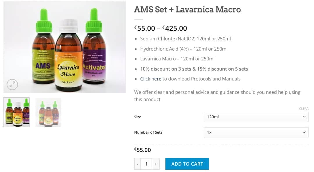
1.-Optimize product images
Use high-quality zoomable images to demonstrate the product’s benefits. Support your main images with alternative angles and photos of the product in use. You can even add videos if your theme allows. Go here for more image optimization tips.
2.-Leverage pricing psychology
Show the discounted price in a smaller font than the original price. This subtle trick makes the discounted price visually smaller than the full price. You can find some other handy pricing tips and tricks here.
3.-Prominently display social proof
It’s the second-most influential factor in e-commerce conversions (source). So make sure your review stars are right under the product title.
4.-Call out the main benefits above-the-fold
If you’re not familiar with the term above-the-fold it comes from the newspaper industry but for our purposes, it relates to what can be seen without scrolling. A short bullet list of benefits (not features) is always a winner.
5.-Trust & credibility
Show the icons for your accepted payment methods and secure checkout immediately underneath your Add-to-Cart button. This adds reassurance and lets shoppers know how they can pay securely.
6.-Add scarcity
This is the most influential factor in e-commerce conversions (source). Display your remaining stock and how many other shoppers have the item in their cart or are viewing the page right now.
7.-Give people reasons to buy
Your value proposition is a huge factor in whether someone decides to buy from you. What do you offer other than good prices? Nail this and your brand will stand out in the crowd. Use icons to represent each part of your store’s value proposition and put them close to the Add-to-Cart button.
8.-Clear shipping & returns
If your returns policy is hard to find on the page or sucks when people read it, your conversions will suffer.
9.-Display recently viewed and related products
This is an easy way to increase Shopify average order value. Not all themes have this functionality by default.
10.-Write persuasive product descriptions
Copying & pasting generic supplier descriptions is a surefire way to kill your SEO and your conversion rate. Here’s how to write product descriptions that sell.
11.-Add urgency
As the third most influential factor on e-commerce conversions (source), leveraging urgency with a countdown timer is a must. If a sale ends soon tell shoppers exactly how long they have left before the deal goes away. You can also add a shipping timer to help get shoppers to buy now rather than later.
12.-Remove social links and share buttons
Most themes pride themselves on putting fancy social sharing buttons under your main product images. You’ve paid to get a visitor to your site so why would you offer up a distraction that will take them away?
13.-Hide dynamic checkout buttons
Although streamlining the checkout process can be a good thing, robbing your store of the chance to upsell or cross-sell other items will make your profits suffer.
14.-Make sizing info easy to find
Hiding your sizing information behind a tiny text link or buried in the product description is fatal for stores selling apparel or anything else that requires sizing charts. Make it prominent and consider adding your sizing chart as a product image too.
15.-Dynamic pricing
If different pricing for different options, then have the price dynamically change based on the option chosen (rather than showing a range of prices).
16.-Dynamic Add-to-Cart button text
When a product has multiple options, consider changing the Add-to-Cart button text to “Select a size (or color or whatever)” if not all the options have been selected by the shopper.
17.-Set the default dropdown option to ‘Choose’
Force your visitors to make a conscious choice of variants before they can click Add-to-Cart. This way you don’t get people unintentionally buying the wrong thing like an extra small-sized T-shirt just because that was the default size.
18.-Sticky Add-to-Cart Button
As soon as shoppers scroll down beyond the Add-to-Cart button it’s out of sight. Forcing them to scroll all the way back up is never a good idea as it creates unnecessary friction that costs you sales. Trigger a sticky add-to-cart button as soon as the static one disappears from view.
19.-Skip the Cart
This one you really need to test to see which makes you more money overall. Whilst removing the friction of going to the cart upon clicking Add-to-Cart may increase conversions, the lost revenue from disallowing visitors to easily continue shopping for other items or the opportunity of in-cart upsells, for example, could cost you more profits in the long run.
20.-‘Back in Stock’ notifications
If an item is ‘out of stock’ allow shoppers to enter their email and get notified when it’s back in stock.
21.-Upsell/Cross-sell
Use an app like UpliftHero to increase your store’s Average Order Value that doesn’t interrupt the customer flow like annoying pop-ups do.
22.-Keep to convention
There’s a big advantage to keeping to typical e-commerce layout conventions. Putting things in places people don’t expect to find them might win you a design award but it won’t win you more sales. Think about it this way, you don’t get into a car you’ve never driven and want to start looking for the gear shift/indicators, they should be obvious.
23.-Offer financing option on higher-priced items
Financing options like After Pay can be a huge conversion boost especially with high ticket products.
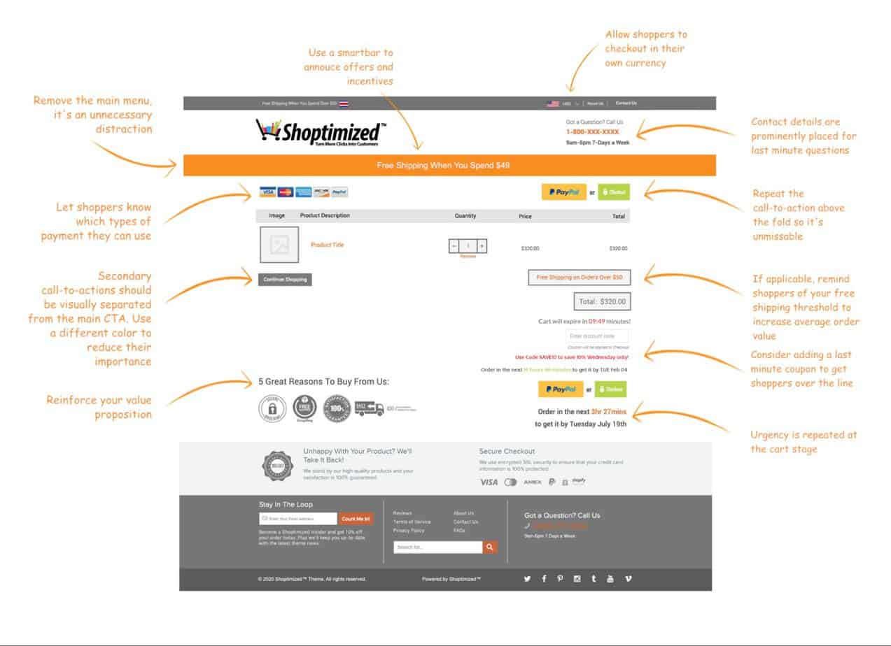
Cart Page
The first thing to note about optimizing your Shopify store’s cart page is that there’s a precarious trend, particularly amongst dropshipping store owners to skip the cart page altogether and take shoppers straight to the checkout when they click Add-to-Cart.
This may not be best for your overall profitability because it robs you of the opportunity to upsell and cross-sell additional items pre-checkout.
12 ways to optimize your cart page:
1.-Hide the Order Notes field
The order notes will leave your customers stumped as to what they need to input. Confusion is a conversion killer so unless you have a critical piece of information you need from them, get rid of this field.
2.-Hide the Shipping calculator
The shipping estimator is just going to confuse your customers and will likely give an inaccurate figure that either sets false expectations if it’s too low or kill the sale there and then if it’s unreasonably high.
3.-Remove ‘Taxes and shipping calculated at checkout’
This unhelpful text is basically telling your customers that you’re likely to stitch them up with some extra charges they weren’t expecting in the next step.
4.-Add an in-cart upsell
An often overlooked upselling opportunity is on the cart page itself. A simple in-cart upsell app will notch up your store’s profitability.
5.-Prominent call-to-action
Repeat the above the fold so it’s unmissable.
6.-Free shipping threshold
Remind customers of your free shipping threshold to help encourage adding more items to their purchase.
7.-Repeat urgency
Show a shipping timer (as recommended for the product page) to tell shoppers when they can expect to receive their purchase if they order before the deadline.
8.-Reiterate your value proposition
Don’t let your guard down and assume shoppers have noticed your earlier efforts to tell them why they should buy from you.
9.-Tell people how they can pay
If they missed it on the product page, reminding shoppers how they can pay adds reassurance.
10.-Remove clutter
The header only needs to contain your logo and contact details at this point in the customer journey.
11.-Remove main navigation
By the time someone reaches the cart page you want them locked in on the task-at-hand — checking out. If they want to navigate to other items they can use the search bar or click your store’s logo to go to the homepage. This works best when your theme has a cart preview pop-up\slider after clicking Add-to-Cart.
12.-Last-minute coupons
A surprise discount leverages the proven principle of reciprocity and helps make shoppers commit to buy. Add in urgency/scarcity by making it valid for that day only and your conversions sky-rocket.
Conclusion
If you haven’t guessed by now, the best converting Shopify theme by Shoptimized™ allows you to do all of the customizations we’ve talked about and much more. So rather than wasting time trying to bend your current theme into shape, switch to The Shoptimized™ Theme today.